11th Aug 2025
A fresh look for Care in Mind…say hello to our new brand and website.
We’re excited to share some big news: Care in Mind has a brand-new look and a brand-new website! This change is more than just a fresh coat of paint – it’s the result of months of collaboration, listening, and careful design to ensure our visual identity truly reflects who we are and what we stand for.
Why the change?
Since we began in 2012, Care in Mind has grown into a national leader in trauma-informed care for young people with complex mental health needs. Our team has expanded, our services have evolved, and our impact has reached further than ever before. We wanted our branding and website to keep pace with that growth – to reflect our professionalism, compassion, and commitment, while making it easier for people to connect with us.
Before starting, our team had already done a lot of internal work to define our values. Those core values – Committed, Innovative, and Collaborative – became the foundation for the rebrand. The goal was not to reinvent who we are, but to build on those foundations, bringing them to life across every part of our organisation.
The Process
Working closely with our Manchester-based PR, marketing and brand agency partner Sugar PR, we kicked off with a series of brand and website workshops. These sessions brought together voices from across Care in Mind – from frontline support workers to senior leaders – to make sure the DNA of our organisation was reflected in the final designs.
These workshops weren’t just about design – they were about storytelling. We listened to the language staff use to describe their work, the values that drive them every day, and the way they want Care in Mind to be seen by the outside world. This insight shaped every creative decision, from the curve of the typography to the tone of the website copy.
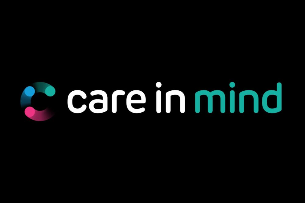
From there, we explored different logo concepts. The feedback was clear: we needed something modern and approachable, but also professional and trustworthy. The final design features a clean, curved typeface and an abstract “C” icon that symbolises connection, care, and togetherness. The icon also incorporates our values through carefully chosen accent colours.
Our colour palette evolved too. We kept our calming teal green as a primary brand colour, supported by a softer, complimentary range of secondary colours. This palette brings a sense of warmth and approachability to everything we create – from our website to our printed materials.
 Brand Guidelines & Staff Rollout
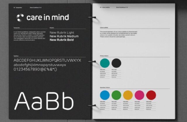
To make sure our new identity is applied consistently, we created a comprehensive set of brand guidelines. These outline everything from logo use and colour codes to typography and tone of voice. The guidelines have been rolled out to all staff, along with templates and examples, so that every document, social post, and presentation reflects the same high-quality, professional standard.
The rollout process included internal briefings, workshops and “brand ambassadors” within different teams to answer questions and help embed the changes in everyday practice. We also created a central resource hub so everyone has quick access to the right logo files, templates, and colour codes whenever they need them.
Staff feedback has been overwhelmingly positive. Team members have said the new branding feels “fresh, professional, and truly us” and that having clear guidelines makes their work easier and faster. The rebrand has sparked pride across the organisation, helping staff feel more connected to the Care in Mind mission.
By empowering our team with the tools and knowledge to use the new branding, we’re ensuring that our identity remains strong and consistent – whether it’s on our website, in our homes, or in the wider community.
The new website
Alongside the rebrand, we completely rebuilt the Care in Mind website. The new site is designed with our audiences in mind – whether you’re a young person, a parent or carer, a referrer, or a professional exploring career opportunities.
We’ve made navigation simpler, content clearer, and information easier to find. The site is fully responsive, so it works beautifully on mobile devices, and it’s built to be accessible, ensuring everyone can explore our services with ease.
The new site also supports our recruitment and referral goals. Job vacancies, service details, and referral information are now more prominent and easier to access, ensuring we connect quickly with the people who need us most.
You’ll also see our values reflected visually throughout the site – from the colour choices to the imagery and language.
Looking ahead
The launch of our new brand and website marks the beginning of the next chapter for Care in Mind. Our refreshed identity will appear across all our communications, training materials, events, and in the places where our teams work every day.
This isn’t just a visual change – it’s a platform for growth. By presenting a consistent, confident, and values-led identity, we’re better positioned to build partnerships, attract the right talent, and support even more young people in the years ahead.
Dr Rachel Scullion, Managing Director, Care in Mind, said: “This rebrand is more than a new logo – it’s a reflection of the journey we’ve been on as an organisation. It captures our values, our dedication to trauma-informed care, and the professionalism and compassion of our teams. I’m proud of how we’ve involved staff at every stage and how the result feels true to who we are.”
Amy Rendle, Head of Strategy and Pathways, Care in Mind, added:
“Our new brand and website give us the tools to communicate clearly and confidently with the people who matter most – the young people we support, their families, and the professionals who refer to us. It’s a fresh, consistent identity that will help us grow, recruit talented colleagues, and strengthen our partnerships across the sector.”